top of page

Hi
Welcome to Joey's website!
Logo, Business Card, Berkeley Times
How do the principles of design effect your design products?
The principle of design really effect my design product. First of all, it looks much better when you follow the principle of design. For example, alignment is the most important part of the design. When I aligned things(text and image), it makes my work looks professional because everything is in the right position. Repetition is also another really important one. Using the same font and color throughout the project will make it easy for the reader and it maintain the tone for your project. Proximity is the third one, without proximity, the images and texts will not be organized and the reader doesn’t know where to read first. Contrast is the fourth one. For my 1st Berkeley Times page, I tried to balance the color between the title and the background image. For the 2nd Berkeley Times page, I used the black and white color because black is heavy but the white is light. Therefore, it balanced. In conclusion, principle of design improved my work and it bring me as a designer to the next level.
Define the 4+1+1 Principles of design: (Crap’n-b)
-
Contrast- is the color you used in your design to grab your reader’s attention. This color will applied in your fonts, tone, size, which makes the reader’s eyes to flow naturally.
-
Repetition- is when you repeat your style, included color palette, font style or font size. This is because professional wants to repeat their style to make it looks professional.
-
Alignment- is really important for your design. Without alignment, your work will look really messy and the reader won’t look at your work. Things are also arranged and organized in the right place, which make the reader to have visual connect.
-
Proximity- is when you group things together, for example, I put all the images on the right side and put all the texts on the left side. This will also make the reader know where to read first.
-
Negative/White Space- is ridiculously important for your design. Negative space make your work to look more clean and has more space, which makes your work to looks good because things aren’t pushed close together. You can see that a professional magazine has a lot of negative space for a reason.
-
Balance- is also another important for your design. Balancing your work will definitely improve the quality of your work because it has an equal on the left, right, top, and bottom. So if you cut your work into four congruent pieces, you will see that all should have equal weight. When the reader read your work, the reader will feel easy to read.
-
How can you use what you have learned this semester in the real world?
I can really used what I have learned this semester in the real word because I can make business card for my dad to promote his products and so people will find it interesting, if the design are good. I can also make logo for other people, like my mom or dad. Berkeley times is also important because in the future, I can make any magazine I want.
-
How did you develop or grow as a student through the semester? (How have your designs gotten better, problem solving skills, independent learning, what are you better at, have yours skills using the programs gotten better)
I think I improve a lot this semester, and I have never used Adobe product before. At first, I really get stressed because I didn’t know how to use Illustrator. However, I tried hard and watch a lot of tutorial to improve my skills. My design also got better because I tried to follow the principle of design as much as possible. Solving problem is another one that I improved. Since I gained more experiences, I know what went wrong with the programme and I could fix it easily.
-
As you look at the work you have completed throughout this semester (Logo, Business Card and Berkeley Times Layouts), what have been your strengths (what are you good at)?
I think my strength are on making making many drafts and choose the best one and tried to watch tutorials and apply it to my work.
-
As you look at the work you have completed throughout this semester, what do you think you could improve on (what was challenging or difficult for you)?
What challenging for me is to make my work looks perfect, for example the image isn’t zoomed enough and that makes the reader to focus on other things instead of the show.

I made this logo as my first draft. I did this for about two hours and I spent a lot of time decided what information I should put in my logo. For example, "IT" and "-2014-". The color on my name is blue and that's because my favourite color is blue. Also, blue is the most common color for website, so I think blue would look good in my logo. For "Grade 9" with brown background, you can see that I didn't apply any color on the letter, but I typed the text and leave the stroke as white. However, I think my second draft is much better.

I made this logo for myself long time ago and this is the second draft that I did. At first, I tried to figure out what pattern I wanted my logo to be, and I started to learn new skills from youtube and apply it to my logo. Later, I have been choosing the color anf the font for a while, because I wanted the color to be bright and so the reader will feel happy and fresh when they see my logo. For the font, chose this font because it's really stand out and it doesn't look boring. So this is my work


This is my business card I did for myself. There are two sides altogether. The first side consists of my name, who am I, phone number, website, address and my sketched photo. As you can see a thin blue line on the right, that was intentional because I want to have blue color on both of the side on my card. Without that line, my business card would look boring and lack of contrast because my sketchede photo is light. For the second side, I just put only dark blue background and put my logo with a white fill in the middle. As it turns out, I think my business card look good and I also have a meaning behind my logo. You can see that the logo I put in is a letter "W". This is because I did this business card on Wednesday, lucky enough the meaning behind this and the logo match.


This is my dad's business card that I made for him. At first, I asked him to send all the information that he wanted to be included in his card. Later, I tried to organized and aligned information in the card. The reason I chose my dad's factory name to be bold is because it is the most information in this card. Following the same pattern, I put the red line on the left and my dad also like it.

This is the first Berkeley Times I have ever did. I did this cover for Berkeley and it took a lot of time to complete this! The challenging steps to complete this page was I need to try every photo and choose the best one. Putting information in here is also a huge challenge. I have been deciding whether or not to put "In This Issue" in here or not. As a result, I decided to not put too much information is here and I came up with more that four drafts! This is the one I thought is the best. The reason I did this is because the yellow scooter is Berkeley's newest facility.
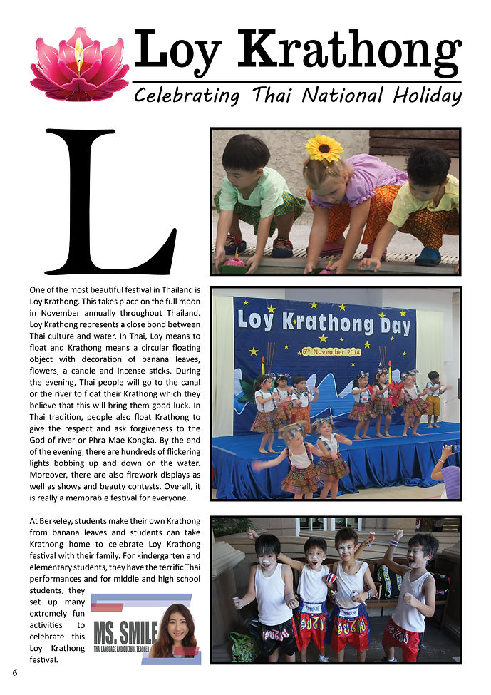
This is the second Berkeley's Times I did in my life. I can see that I didn't chose to do the cover anymore and that's is because I wanted to do something new and have a good experience on both of the cover and that pages. This time, I needed to make sure that there isn't anu hyphenation and everythings are aligned correctly. Before I did this draft, I did it on the first draft first, however, it doesn't look good and I tried to looking for some design inspiration. The big "L" was what I found and it was on perpose. I thought the big "L" make my design looks really professional. Therefore, this is the result.
bottom of page